How to become a great designer by spotting a good design.
Before jumping into a UX profession I don’t pay attention to things around me. For me, good design equals beautiful appearance. Focusing on aesthetic. I criticize things for the sake of criticism.
Have they chosen a great color combination? Is the design artistic or not. Being a UX designer, I’m learning to look at things differently. I started questioning why this product has this feature? What is the shape for? Did I get the right instruction or not? Overall do I feel delighted about the product.
Let me share to you my brief observation about the 3 ATM’s I found in the mall.
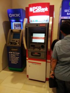
I fall in-line to my bank’s ATM machine. The 3rd ATM machine from the right side. I didn’t bother to check the other two because it’s not the ATM that I was looking for.
While waiting on my cue to use my bank ATM machine, something caught my attention. I saw a man goes in front of the first ATM the (blue one) but immediately transfer to the 2nd ATM machine. After trying to use the ATM machine afterward, he complains that the ATM was not working. The same thing happens when someone tries to use the two ATM.
What’s going on with the two ATM machine?
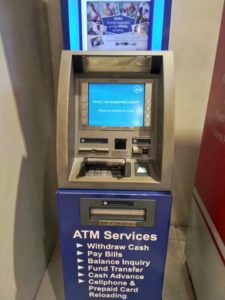
Here are the Photos of the two ATM machines.
The blue one has a label that says
“Sorry, I am temporarily closed. Please try another terminal”
The red was labeled
“Thank you for banking with us”
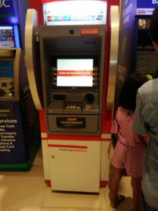
This explains why at first glance you would know the Blue ATM machines were not working. The screen ATM machine gives a clear notification that it was not working. While the other gives you a vague message of what was the status of the machine. The user keeps’ on trying. Only to find out that they won’t be able to do any transactions because it’s not working. Frustrating right?
In UX (user experience) design, we tend to design not only to make the physical product beautiful. We also take account that is delightful to use. We need to avoid frustration when using the product and even before we begin.
The situation above shows you the two fundamental principles of design interaction – Visibility and Feedback.
Visibility is the basic principle that explains, the more visible an element is, the more likely users will know about them and how to use them.
While Feedback is the principle of making it clear to the user what action has been taken and what has been accomplished.
The blue ATM machine provides a helpful message, even at first glance, that you can’t use it.
Also, when the user click any of the buttons on the red ATM, a proper response should show. In the above case, the ATM machine should provide a message telling the user that it’s not working. That would be a great help.
The key to creating a good design is to never leave the user guessing about what action they have taken and the consequence of doing so.
Remember this
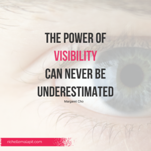
The power of visibility can never be underestimated